Overview
Dashboard 2.0 lets analysts, partners, and other non-technical users configure dashboards without waiting for engineering. Build time dropped from roughly 20 hours to 1, and the dashboards became more consistent because everyone now builds from the same blocks.
The Problem
The legacy solution required Configuration Engineers (CEs) for setup and updates, limiting agility for analysts and partners.
- Bottleneck: No intuitive, no-code way for non-technical users to configure dashboards.
- Lack of Autonomy: Analysts could view dashboards but not edit or create; Dependency on CEs for changes.
- Limited Power: Cross-chart filtering and creation of new charts weren’t accessible in normal workflows.
- UX Friction: Inconsistencies in naming, behavior, and saved vs unsaved states caused confusion.
Goals & Hypothesis
- Self-service dashboarding: Enable non-technical users to create, edit, and share dashboards.
- Interactivity: Consistent global filters across data sources and scopes.
- Modularity: Reusable, modular architecture: Queries, Portlets, Dashboards as libraries.
- Impact: Adoption uplift through reduced friction, faster setup, less engineering involvement.
Hypothesis: If non-technical users are given tools to build dashboards themselves, then dependence on configuration engineers will drop by ~50%, dashboard delivery time will decrease, and overall satisfaction will increase.
Process
1. Discovery
- Interviewed stakeholders (analysts, engineers, partners) to uncover current pain points.
- Key insight: unsaved-changes behavior and naming conventions were major sources of user errors.
- Aligned with engineering to define the technical foundation: PA Query API.
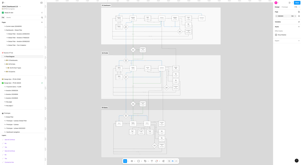
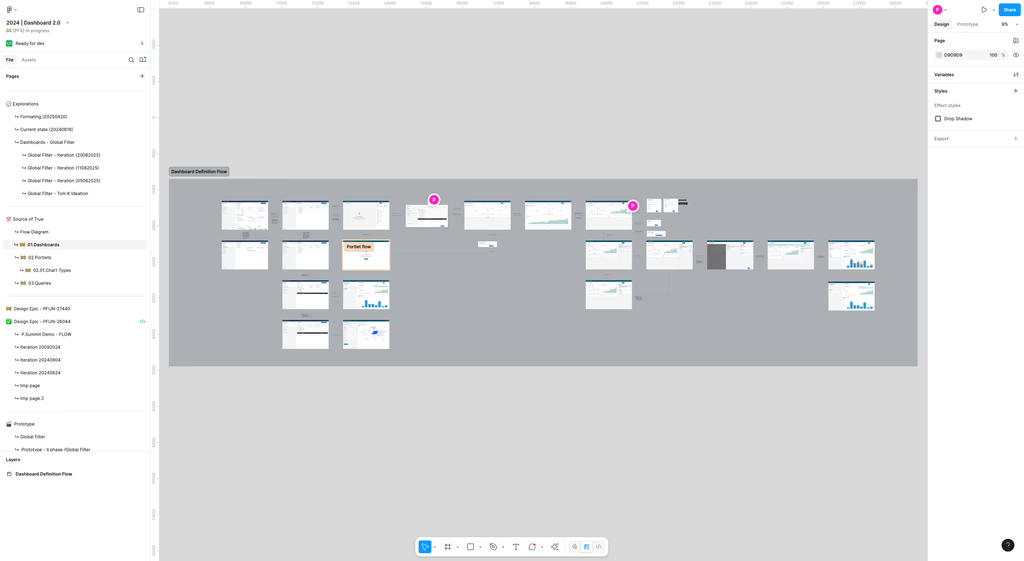
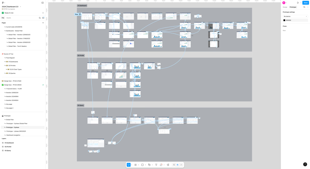
2. Design & Prototyping
- Wireframes / low-fidelity flows for viewport including portlet creation, drag/drop, editing, cross-chart filtering.
- Defined interaction patterns: global filter behavior, naming model rules, modal dialogues for unsaved changes.
3. Validation & Testing
- Usability tests with internal strategists and partners.
- Survey on global filters to verify expectations.
- Adjusted wording, modal behavior, default states based on feedback.
4. Delivery & Rollout
- Scoped MVP: prioritized features that deliver biggest impact (dashboard creation, portlets, editing).
- Released behind feature flag to coexist with Dashboard 1.0 to minimize risk.
Outcomes & Metrics
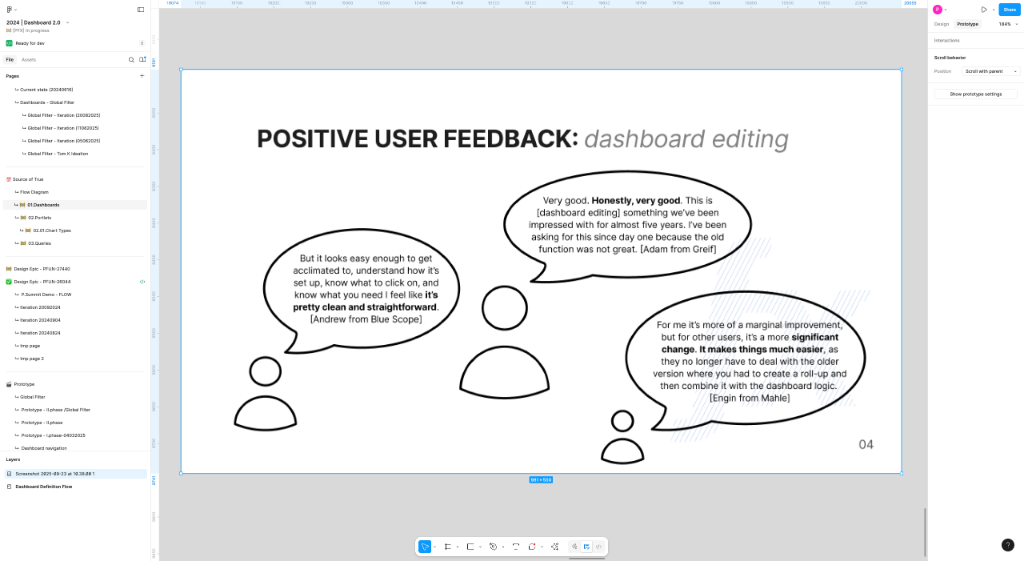
User Satisfaction: Survey scores improved. Qualitative feedback: “It feels less risky to try out new dashboards.”
Reflection & Next Steps
- What I learned: Balancing flexibility with guardrails is tricky. Too much freedom leads to messy dashboards, too much restriction frustrates power users.
- Challenges: Legacy compatibility, ensuring performance across many portlets, designing intuitive yet consistent filter behavior.
- Next steps: Enhance sharing & collaboration workflows, add versioning of dashboards / portlets, and improve analytics on dashboard usage.
My Role
As the Product Designer I owned the information architecture, flows, interaction design, and usability testing. I worked with engineering on the API definition and with stakeholders on prioritization.